

Currently, having access to accurate and real data is essential to make correct and strategic decisions. A tool with a lot of potential for financial analysis, and which we have already told you about, is One View Reporting for JD Edwards.
When we are told about a new feature, we often do not use it because we assume that learning to use it will make us waste a lot of time, search through documentation that is too detailed and that it will not provide us with anything valuable enough to compensate for the time spent.
In this blog we show you, step by step, through a simple example, the potential of this tool and how you can use it without the need for technical knowledge quickly and easily.
Ifyou want to know more about the One View Reporting tool, you can read our previous article, where we explored what this JD Edwards functionality is, and its benefits.
One View Reporting, is available on all JD Edwards screens, whether standard or custom-made, and allows you to display the data from the filters that you have customized on your screens. I have to point out that One View Reporting also has several reports installed by default available in almost all JDE modules, most of them very useful.
Benefits of using JD Edwards One View Reporting
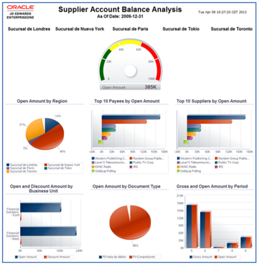
Oracle JD Edwards EnterpriseOne One One View Reporting (OVR) allows you to query, analyze, and customize operational information directly from the ERP, without relying on IT for each report. Its filtering, visualization, and export capabilities facilitate access to real-time data and help speed up decision-making. In addition, reports can be shared between users and used in different environments and devices, making OVR a practical tool to improve the exploitation of data and the autonomy of JDE users.
There are numerous benefits of this interactive tool, among them we can highlight the following:
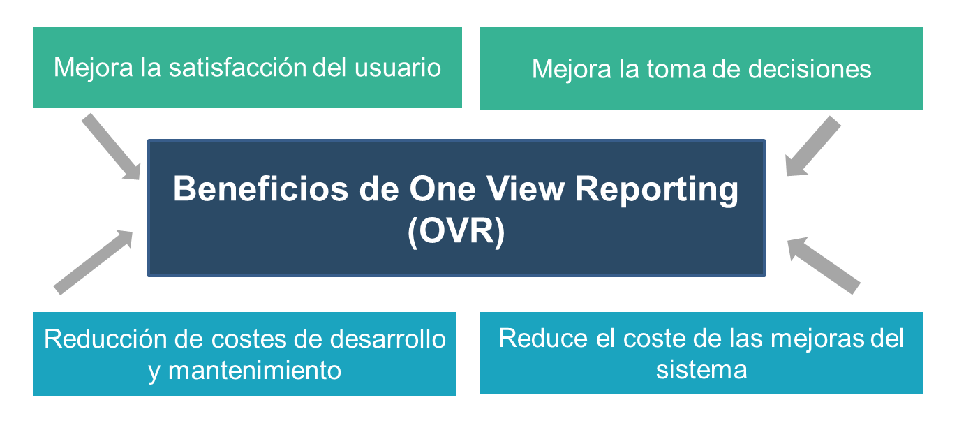
- Improved user satisfaction, allowing users to create reports autonomously, intuitively and in real time.
- It improves the organization’s decision-making, providing access to information at a reduced cost.
- Reduces the cost of system enhancements by eliminating custom applications for data visualization and reporting.
- Reduction of development and maintenance costs, eliminating the action of the IT team and external services for reporting.
The analysis capabilities are infinite and applicable to all areas of the company (financial, inventory, production or sales, among others). It allows adequate control and planning of the critical points of the organization in order to guarantee an increase in user productivity, by dedicating their time to analyzing the information instead of building it for adequate decision-making.
Steps to follow to create a report from scratch
Create the chart in One View Reporting
For our practical case, we will start with the largest number of customers, from where we will analyze the status of their invoices. As we will see, the process is very simple and any business user can do it without the need for technical knowledge and without support from the technology area, quickly and easily.
For example, it should be noted that the data that will be visualized while building the graphic design of the report is a portion of the final data, so it should not be considered while designing, and should only be reviewed once the design is finished and applied to the final report.
Once inside the screen, select the One View Reporting option.
From here we create a new report and assign the fields that we consider useful for our analysis. In this case, we are going to analyze the outstanding debt that our customers have, compared to the total turnover of each one. So, in this example, the fields we are going to choose are:
- Customer name and ID data
- Those associated with total and debt amounts
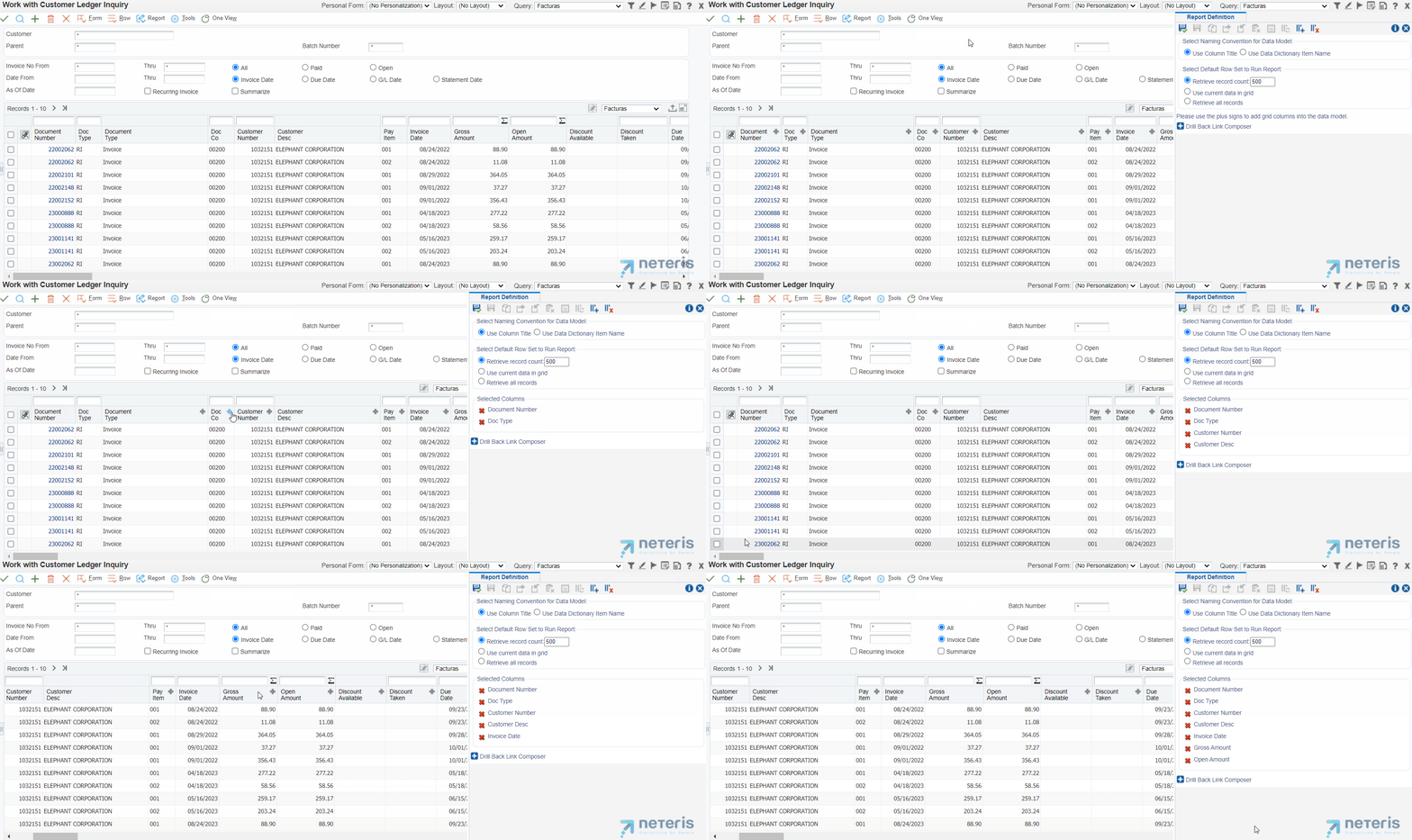
When all the fields that interest us are selected, we save the report and assign it a name. In this way, we will have the report available both for the analysis we are going to carry out and to directly access the data. It should be noted that apart from selecting the fields that are necessary, the data can also be filtered , to discard the records that are not useful for the analysis.
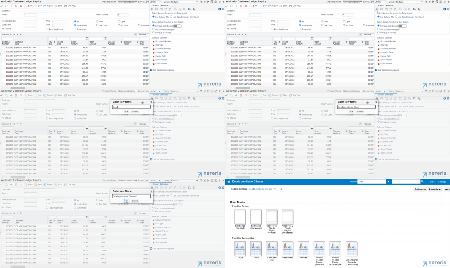
Once saved, JDE will directly open the BI Publisher tool. This is where we will have at our disposal the possibility of adding graphs, tables, etc. to visualize the data graphically, so that it is easier to execute the analysis.
In addition, you can add texts, images, and other components to format the report and give it a better appearance associated with the corporate format of your company. In any case, you have the option of creating a blank report or using one of the templates offered by the tool. In this example, we are going to start with a blank template, in which we will add various components to show how simple and powerful it is.
BI Publisher tool for graphical data visualization
1. Create a design grid and add our logo
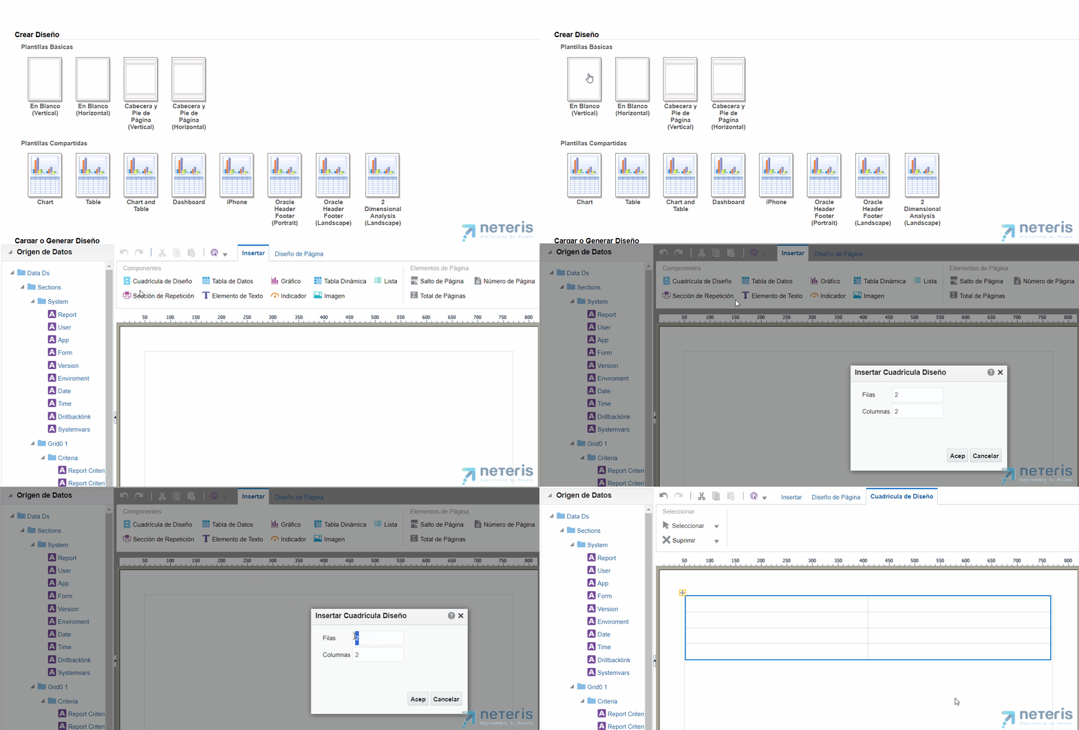
First, we’re going to add a design grid, and then we’re going to place the components that we’ll use in the cells that make it up.
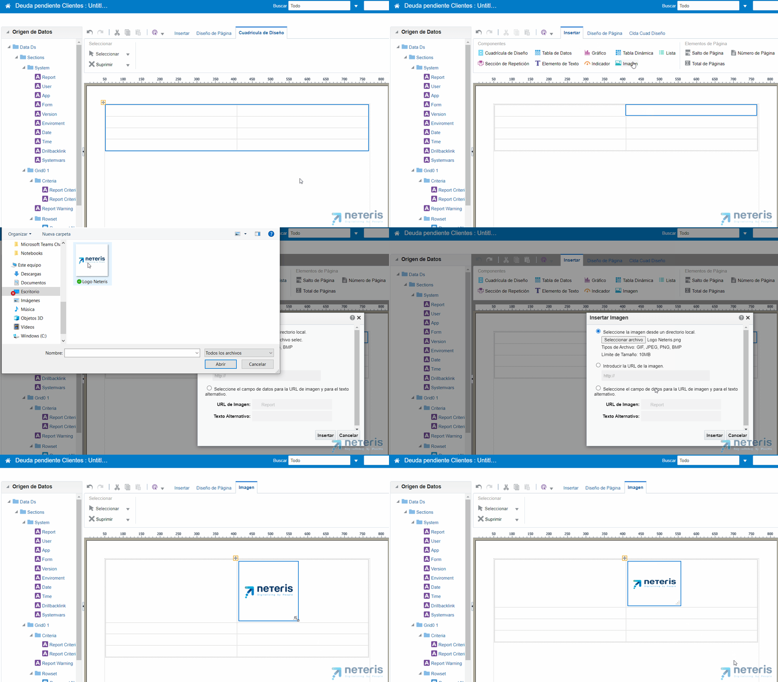
The first component we will add will be our company’s logo, to give a more branded look to the Report. To do this, we just have to indicate the cell where we are going to add it, select the Insert tab, and then the Image. Next, we select the graphic file with the company’s logo and insert it. The image will be inserted with its original size that we can of course increase or decrease at will.
2. Add a title to the report
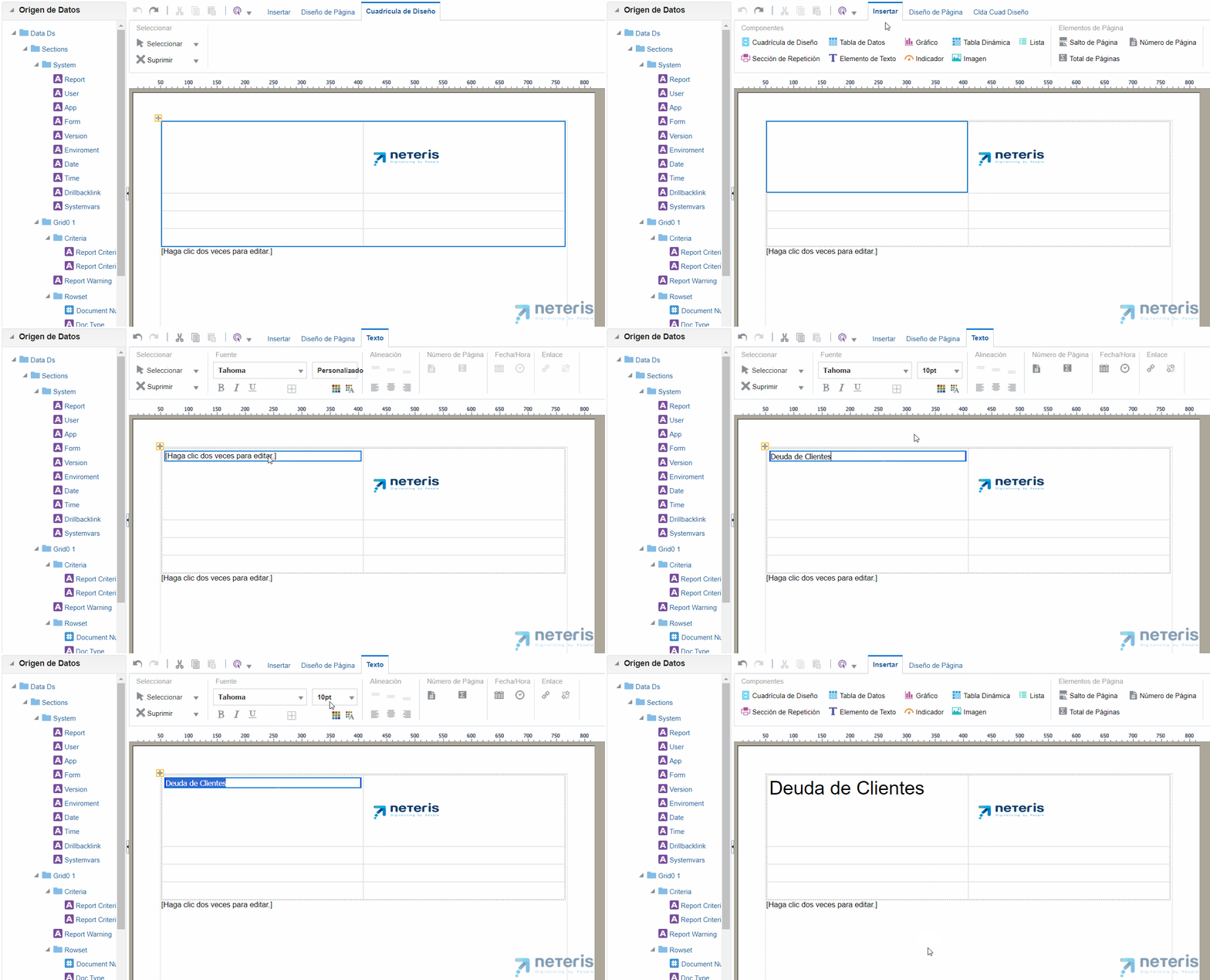
Our report is going to need a title, so similar to the image we select the cell where we want to add it, click on the Insert tab, and then Text Element. Once this is done, we just have to click on it to edit it and add the text of the title, and put the desired font, size, alignment, etc.
Now that we have the formatting elements in our report, let’s add the really interesting thing: the components that will show us the data for analysis.
3. Add a Stacked Bar Chart
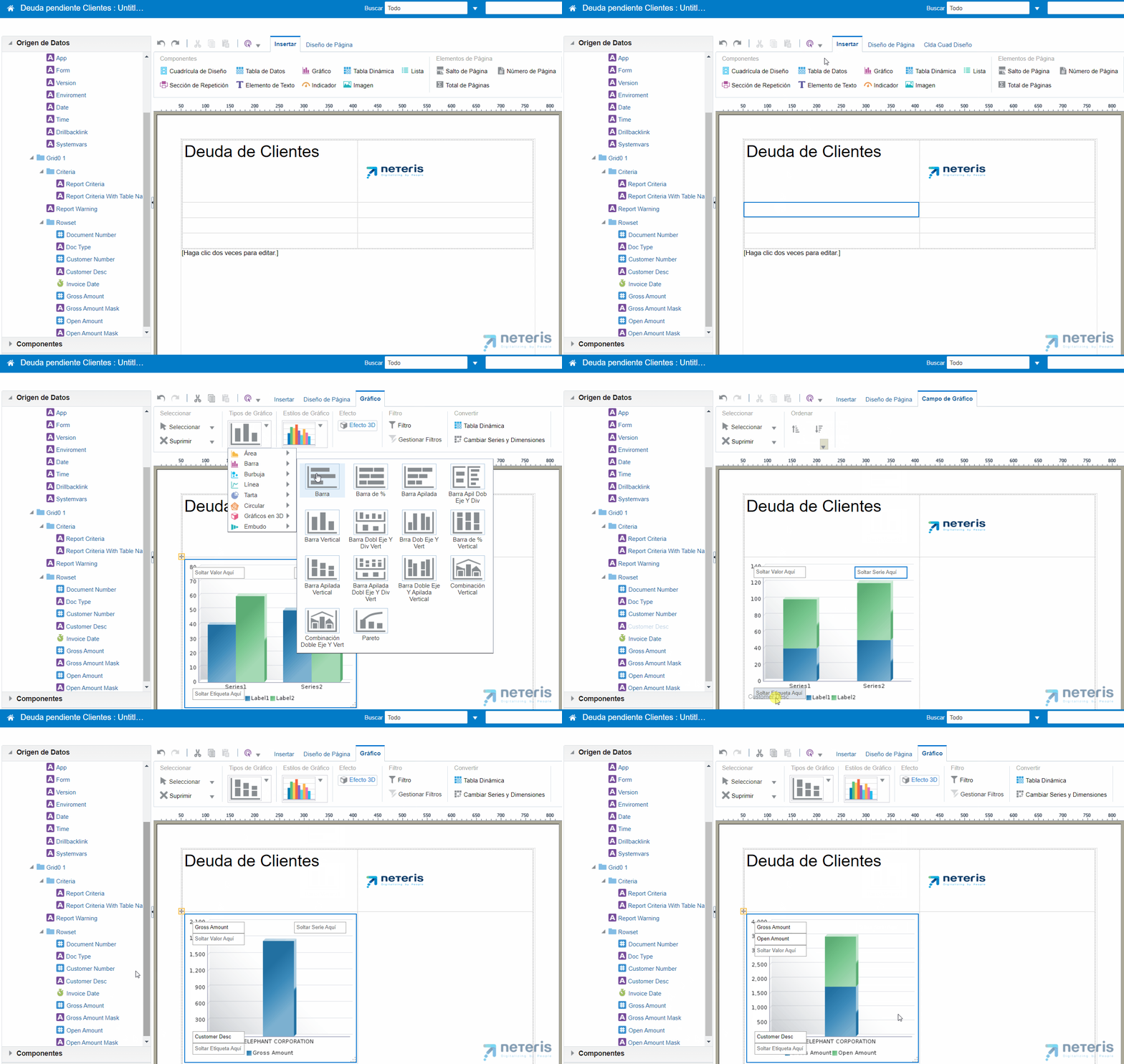
First, let’s add a stacked bar chart that we’ll paint on:
- X-Axis: The Customers’ Name
- Y-axis: outstanding debt and total turnover
Thus, with a simple glance we can see if any of them have a significant amount of debt with respect to the total.
To do that, we go to the Insert tab, select Chart Types, and choose the stacked bar one.
Assigning values to axes is as simple as dragging from the list of fields on the left the locations marked as Drop Here from the chart, so we do it with customers and total and pending amounts.
4. Add a pie chart
To have a global view of the debt independently of the customers, we can add a pie chart in the cell to the right of the previous graph. To do this we do the same, from the Insert tab we select Chart Types and then the Pie Chart. Then we drag the fields with the total and pending amounts to the graph, this time without segmenting by customer.
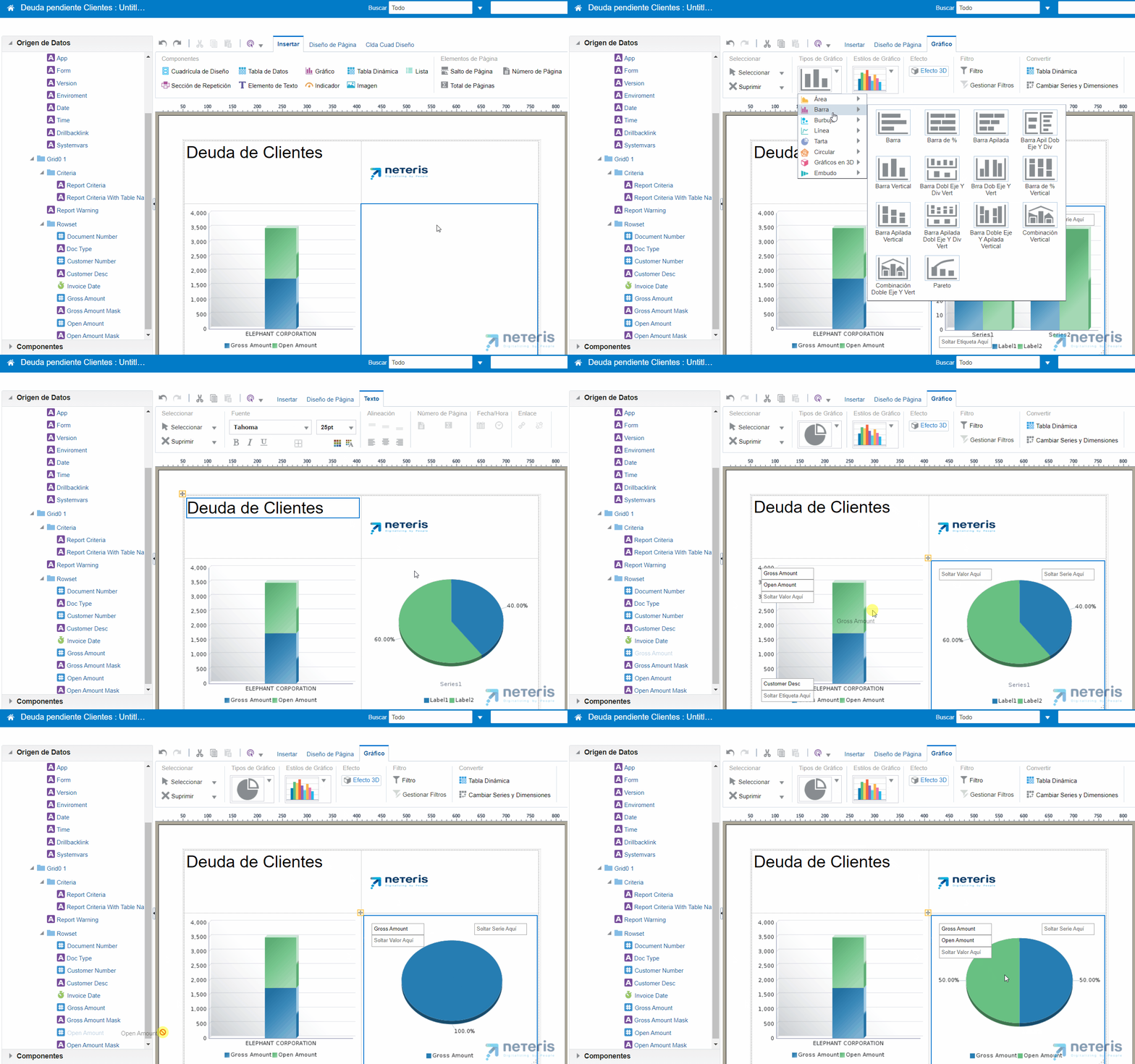
With this we already have a graphical view of the state of the debt. Let’s now add a data table to be able to see the individual detail of each record.
5. Add a data table
First, we’re going to join the two cells below to have enough room for our table.
Next, we add the table as we have done with the rest of the elements. From the Insert tab, click on Data Table and then drag the fields we want to add to the table from the list on the left. As we will see, by dragging each of them the data will be shown in the table, and we can change the width of each column or order them in the way that suits us best.
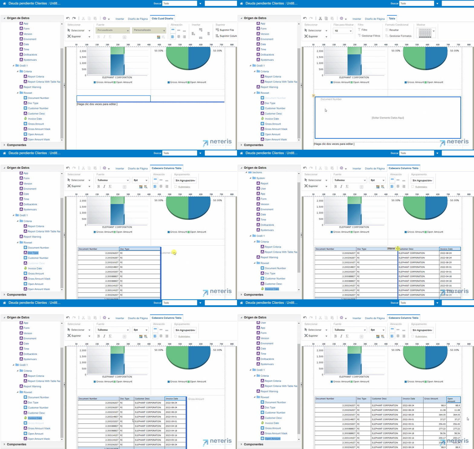
When we have all the fields with the detail of the data, we are going to change the formats of the total line, in which we can apply different aggregations, such as sum, mean, count, etc., to each field.
6. Change the formats of the total line in the data table to apply different aggregations
In our case, we are going to count the document numbers to know the total number and add the two columns of amount. Once this is done, we can finish the design of the report and we can save it, for which we only have to select the option and give it a name.
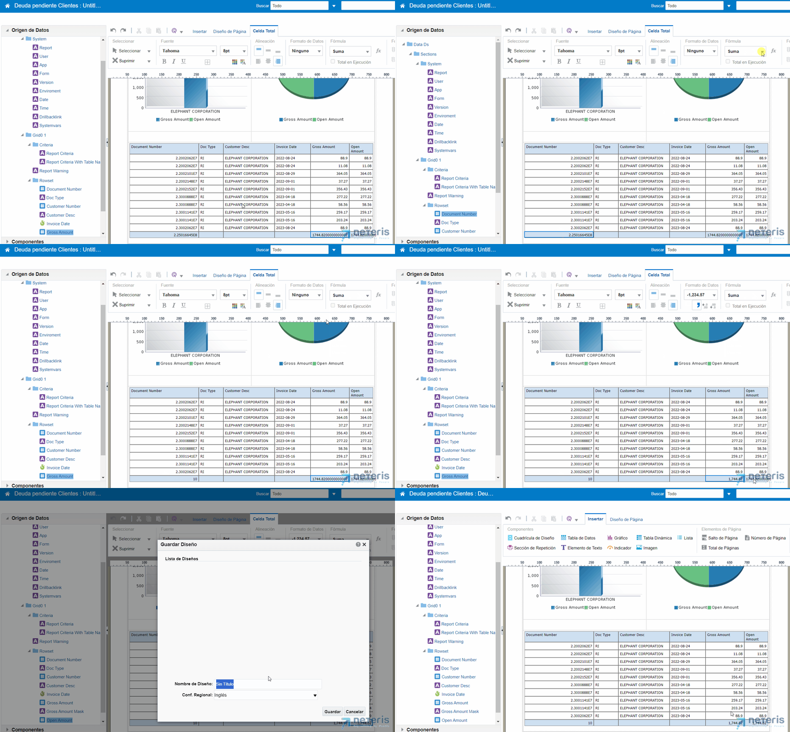
When you click on Back, the design will be automatically applied to the report. The data that will appear here is already complete and real, unlike what we saw while designing it, since as we indicated at the beginning, these were only a portion of them until now.
The report is interactive, and we can select, for example, an entire client to see the detail of their documents, or filter the data to view only those that meet the condition we are interested in.
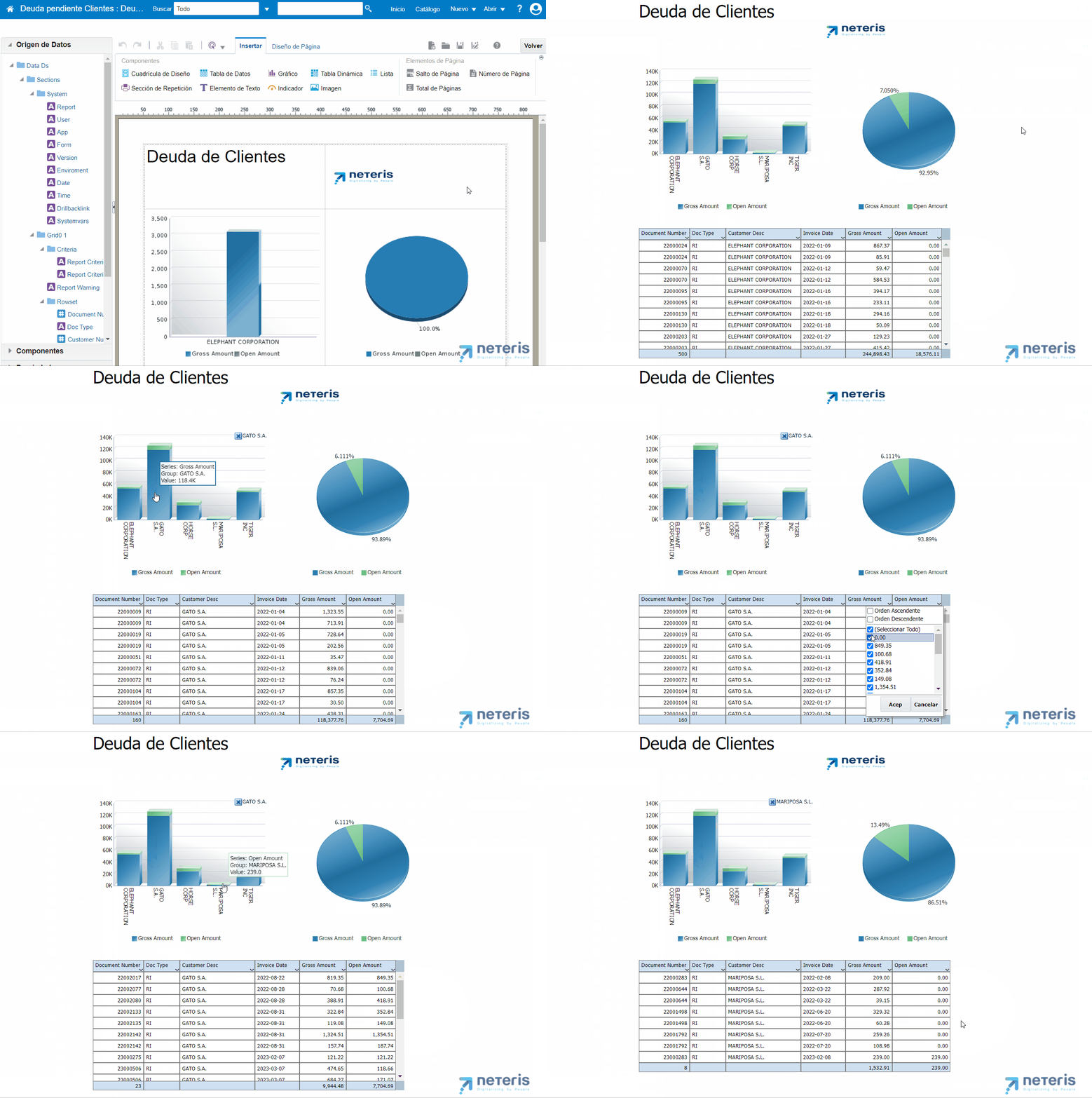
7. Change the format of the report to share it with users who do not have access to BI Publisher
The tool also allows you to export the report in various formats, so that you can share them with users who do not have access to the BI Publisher environment. For example, in our case we are going to export to PDF those related to a specific client. With this functionality it is really easy to distribute this information, simply by attaching it to an email.
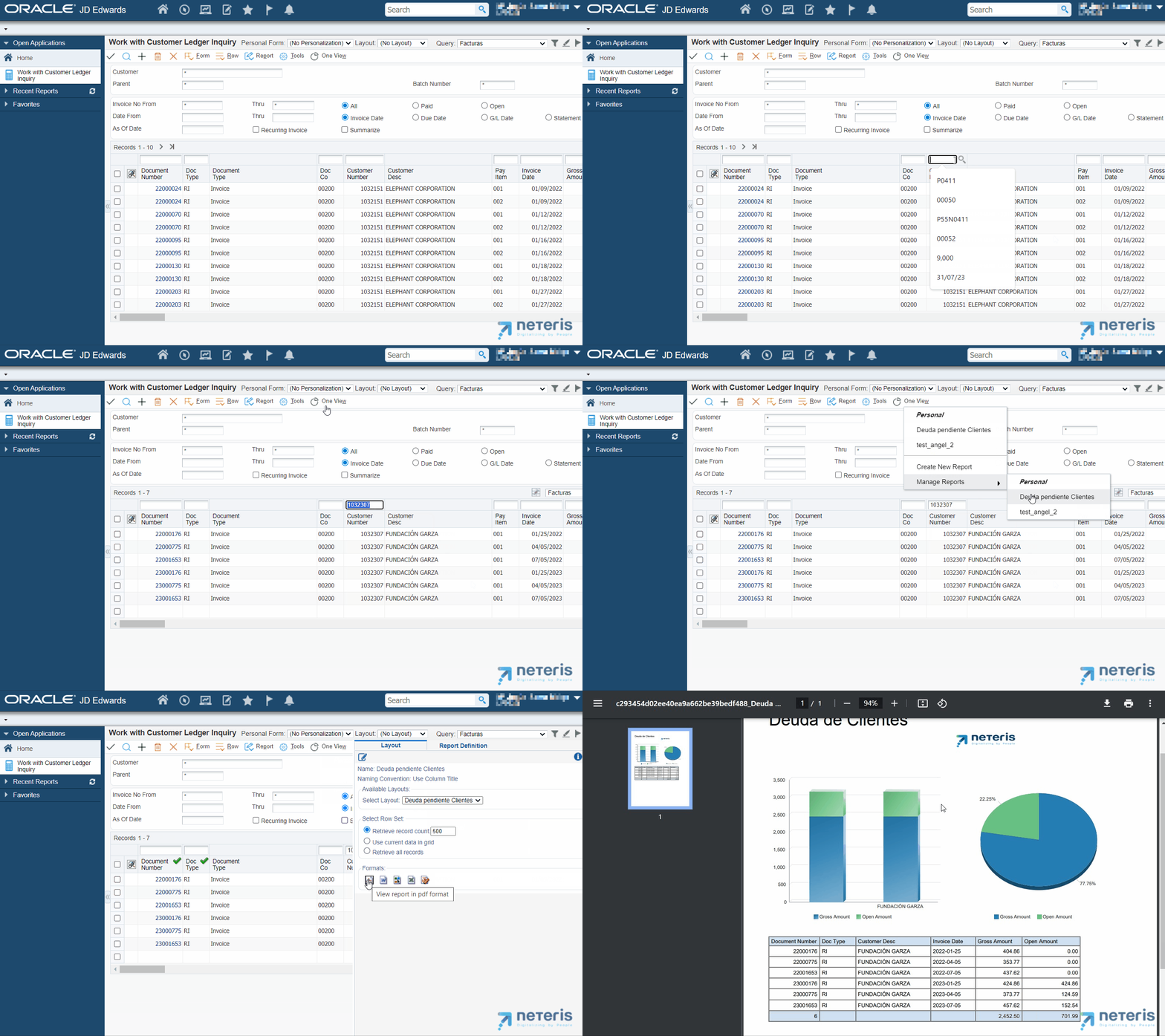
This is just a quick sample of everything we can do with One View Reporting to improve our financial analysis. In addition, everything we design can be easily shared with other users outside or inside your company, even if they don’t have access to the tool.
One View Reporting gives us versatility to explore various options and functions that will allow us to create detailed and specific reports in a very simple way, and without the need for technical knowledge.